top of page
Carport Cafe.
Brand Identity
Carport Café is a community-focused breakfast spot in Cannon Hill, born from a converted petrol station in 2019. Despite launching just before COVID, the brand grew a loyal following and has since expanded to two additional locations.
The Brief.
Reimagining Carport Café's visual identity for a Symbols & Branding assignment at Torrens University. The goal was to move beyond a simple logo refresh, expanding the brand into a full style guide that felt fun, welcoming and modern, while staying true to the café's community spirit.


Primary Logo.
Early concepts including a number-plate layout felt too literal. Shifting focus to edited typography as the hero element, supported by an energetic, interchanging colour system, struck the right balance between character, clarity and warmth.


Secondary Logo.
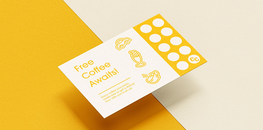
A simplified "CC" mark was developed for smaller touchpoints, social media, stationery and packaging, where the primary logo wouldn't fit. The double "C" retains brand personality while building recognition across limited applications.
Colour Palette.
The three-colour palette (pink, yellow and blue) was chosen intentionally. Pink brings warmth, yellow adds energy, and blue grounds the system with reliability. Used consistently across all touchpoints with white type, the palette keeps the brand bright, cohesive and instantly recognisable.
#168AB2
#EC0868
#FEBB12

Selected Typeface.
Darkmode was chosen as the sole typeface, with Black for headings, Xbold for subheadings and Medium for body copy. A strict hierarchy across all mediums keeps the brand voice consistent and considered.
Additional Media.
Beyond the logo, the visual toolkit was expanded with a custom symbol set, graphical pattern and website landing page. The pattern, restricted to Carport Yellow as its only supporting colour, demonstrates versatility across packaging, merchandise and artistic applications, holding its own as a standalone element without text or additional graphics.


bottom of page