
PURE ORCHID
How I'd Design an Apple Juice Label Worth Keeping
Pure Orchid is a homegrown apple juice brand built on nostalgia and warmth. Inspired by early morning breakfasts and family recipes, the brand blends natural flavour with heartfelt storytelling, capturing the simple joy of childhood in a modern, wholesome way.


Pure Orchid is a homegrown apple juice brand built on nostalgia and warmth. Inspired by early morning breakfasts and family recipes, the brand blends natural flavour with heartfelt storytelling, capturing the simple joy of childhood in a modern, wholesome way.
How I'd Design an Apple Juice Label Worth Keeping
PURE ORCHID
PASSION PROJECT | PASSION PROJECT | PASSION PROJECT | PASSION PROJECT | PASSION PROJECT | PASSION PROJECT | PASSION PROJECT | PASSION PROJECT | PASSION PROJECT | PASSION PROJECT | PASSION PROJECT | PASSION PROJECT | PASSION PROJECT | PASSION PROJECT | PASSION PROJECT | PASSION PROJECT | PASSION PROJECT |
THE BREIF & CHALLENGE
Most apple juice packaging on shelves today looks nearly identical — minimal, clinical, corporate. That sameness makes it easy to overlook, and impossible to form any real emotional connection to. The challenge I set myself was designing a label that broke from that trend entirely: packaging charming enough that someone wouldn't just drink the juice and toss the bottle, but want to keep it, repurpose it, maybe even grow a plant in it. That meant leaning fully into charm over polish, and illustration over minimalism.
THE SOLUTION
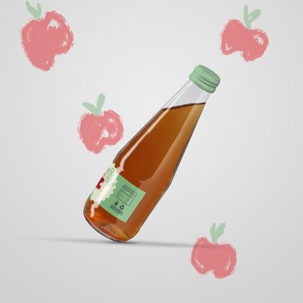
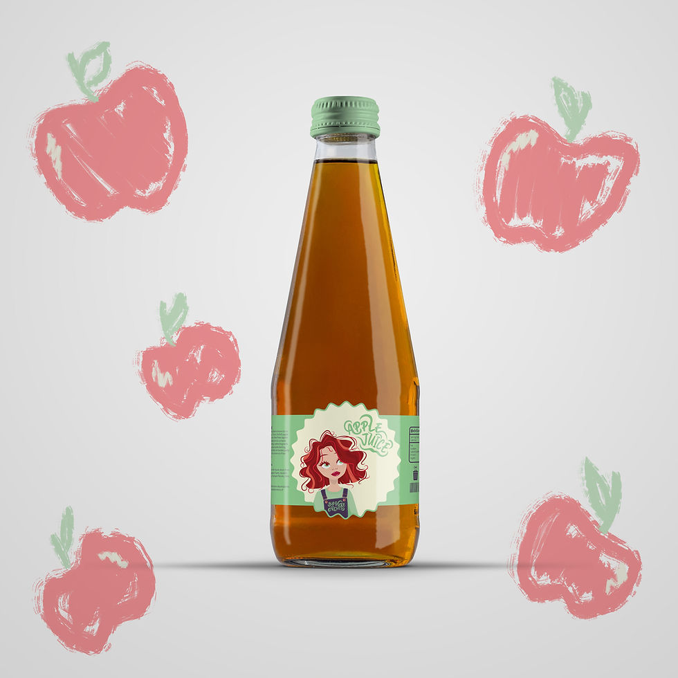
I moved away from the clean, typographic look dominating the category and built the label around a custom vector character — bringing a nostalgic, whimsical quality that no competitor on the shelf was offering. Illustration-driven design is where I have the most fun, and this project gave me full creative freedom to lean into that, rather than defaulting to the safe, minimal approach the category has settled into. The result is packaging designed for a second life — something worth keeping on a windowsill, not just recycling.
.png)
.png)
