ACT WRITE ENTERTAINMENT
How I'd Refresh AWE's Brand Identity Without Losing Its Story
AWE (Act Write Entertainment) is an Australian film and stage production company founded by actor, writer, and filmmaker Don Batee. Producing socially conscious content across film and live performance, AWE is built on three core values — integrity in creation, truthful storytelling, and purposeful social impact. Their award-winning work spans feature films, theatrical productions, and documentary series exploring cultural identity and socio-political themes.

AWE (Act Write Entertainment) is an Australian film and stage production company founded by actor, writer, and filmmaker Don Batee. Producing socially conscious content across film and live performance, AWE is built on three core values — integrity in creation, truthful storytelling, and purposeful social impact. Their award-winning work spans feature films, theatrical productions, and documentary series exploring cultural identity and socio-political themes.
How I'd Refresh AWE's Brand Identity Without Losing Its Story
ACT WRITE ENTERTAINMENT
CONCEPTUAL PROJECT | CONCEPTUAL PROJECT | CONCEPTUAL PROJECT | CONCEPTUAL PROJECT | CONCEPTUAL CONCEPTUAL PROJECT | CONCEPTUAL PROJECT | CONCEPTUAL PROJECT | CONCEPTUAL PROJECT | CONCEPTUAL PROJECT | CONCEPTUAL PROJECT | CONCEPTUAL PROJECT | CONCEPTUAL PROJECT | CONCEPTUAL PROJECT | CONCEPTUAL PROJECT

THE BREIF & CHALLENGE
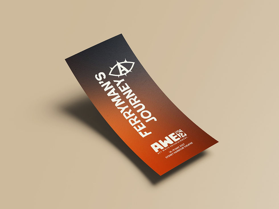
AWE needed a unified brand identity, a primary, secondary, and icon logo suite, colour palette, typography system, and full style guide, but the real constraint was that this wasn't a blank-slate rebrand. Their existing identity, built around the Kokopelli symbol, already carried meaning tied to storytelling and movement, and needed to evolve rather than be replaced. Alongside the core identity, the brief also called for a visual direction for their production A Ferryman's Journey, applied across digital and print assets.


THE SOLUTION
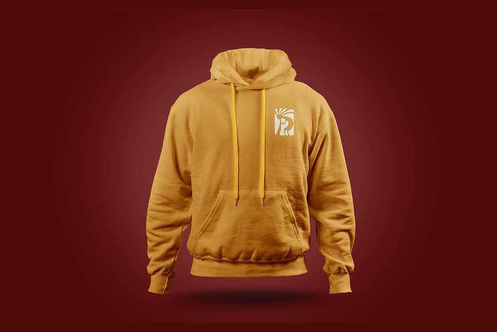
I simplified and modernised the Kokopelli symbol into a scalable, minimal mark, preserving its original meaning while making it work across modern touchpoints. A hand-drawn approach added a human quality, paired with a custom AWE wordmark and the Greycliff typeface for clarity and contrast. Multiple logo variations ensured flexibility across every application, from a full lockup to a minimal icon. For A Ferryman's Journey, the poster used strong visual hierarchy and symbolic imagery, an eye motif representing memory and personal history, with a warm, textural palette reflecting themes of identity, place, and transition.


